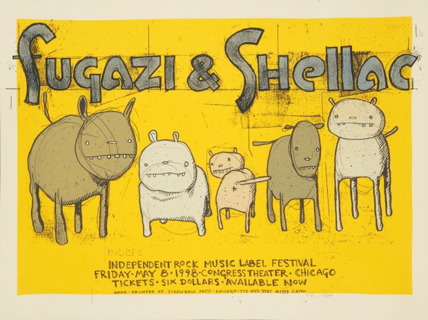
Rock posters are dirty little things—mass-produced pulp targeting your baser instincts. They’re also potent cultural artifacts worthy of gallery spaces. In the early days of rock-and-roll, screen printing was a practical option. The practice was borrowed from boxing promoters and political campaign managers. But in the 1960s, rock poster production shifted away from screen printing and toward the more efficient offset lithography printing process to accommodate higher demand. At a time when America’s rock subculture was earning its artistic legitimacy, screen printers were demoted to churning out high school gym shirts by the thousands. The medium persisted in its art-gallery exile for a time but largely lay dormant until the 1980s, when a nationwide indie rock movement took hold. As DIY bands found small-scale success, rock poster revivalists like Frank Kozik rekindled nostalgia for the old-school process. Screen printing shops enjoyed a renaissance, turning out a steady stream of posters from the country’s more musically inclined locales.
Starting out in Chicago in the mid-1990s, Jay Ryan found himself in the middle of this revival and has proven himself fundamental in the evolution of screen printing as an artform. Born in St. Louis, Ryan has lived most of his life in the Chicago area, where he now works out of his own shop, The Bird Machine. He creates simple and functional placards for some of his favorite bands; they double as inspired surrealism in the poster-making tradition. His work also serves as a unique historical record of the Chicago music scene over the past two decades.
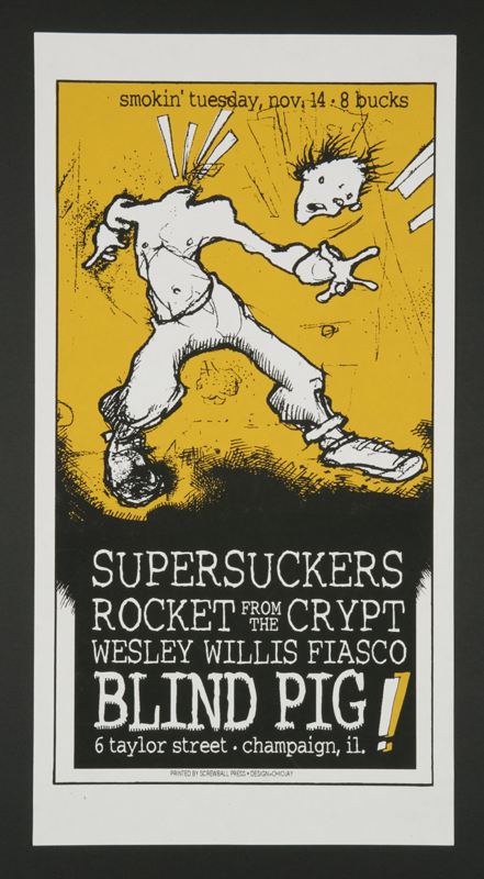
“I grew up in a suburb of Chicago with both parents and two younger siblings with lots of time spent up trees and under bushes. I liked to draw and ended up at the University of Illinois in Urbana-Champaign in the fall of 1990 and switched majors to painting the following year just as Nirvana released Nevermind and pop culture took a hard turn. Champaign’s music community was pretty exciting, and once grunge hit, all the larger local bands were getting approached by major labels. The guy from my figure-drawing class played bass for Hum, the nude model we were drawing was the drummer-singer of Lonely Trailer, and then there was a grad TA from Honcho Overload. The Poster Children were already on MTV, and soon Hum, Hardvark, Lovecup, Menthol (aka Mother), and others were moving on to bigger labels as well. Braid and American Football would soon follow.”
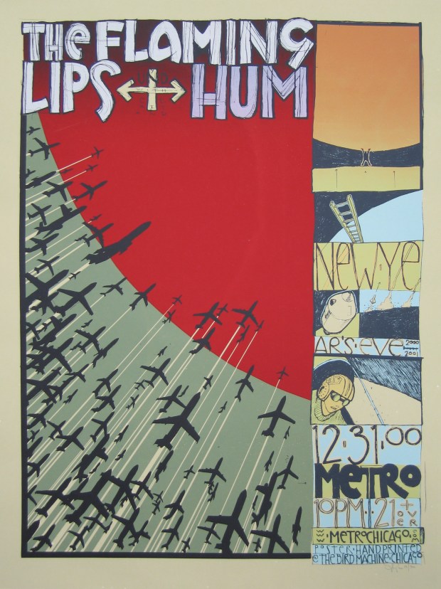
“I moved back to Chicago after school, unsure of my next step, and through freelance connections I was asked to do a poster for Rocket from the Crypt and the Supersuckers. I met up with a guy called Steve Walters who would print it for me, and I started screen printing at his Screwball Press in 1995. This was before normal people used the internet, so we had no idea what was happening in other cities. My friends were all in bands, going out to Lounge Ax, the Bottle, Fireside Bowl, Schubas, and screen printing was fitting because it was cheaper than digital. And the hand-done nature fit the music. Plus it’s fun, and the prints, as objects, hold weight in a way that some color photocopy doesn’t when hung in the front window of Reckless Records or Quimby’s Bookstore.”
“The poster is a relatively simple form. It’s one page, one shot, has to convey some useful information (though clarity is subjective), and it has to get the viewer’s attention. Within those parameters, I guess I’m some distant cousin of the Viennese Secessionists, simply through some of the grids I used to use to box images in on the page. I don’t know if that even applies to my work anymore. I think it did more 20 years ago.”
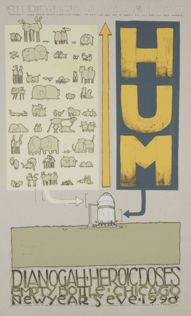
Visually, I’ve never been a boobs-and-drugs kind of guy. I think there’s enough objectification of women already. I left the images of ‘buxom skulls shooting heroin while drag racing against Rat Fink Frankenstein’ to other people. I wanted to try to get the same effect but using raccoons and toasters and wombats and chairs. If I draw a person swinging a tennis racket in a poster, it raises the question of why is the person this gender? What’s their race? Those choices all influence how the viewer sees the image. But if I draw a platypus swinging a tennis racket, everyone can get on board. I think the animal figures have come to represent actions as opposed to characters. Someone crashed their bike. Someone built a chair using meat (and they’re proud of it). Someone is late to get to the rubber band store.
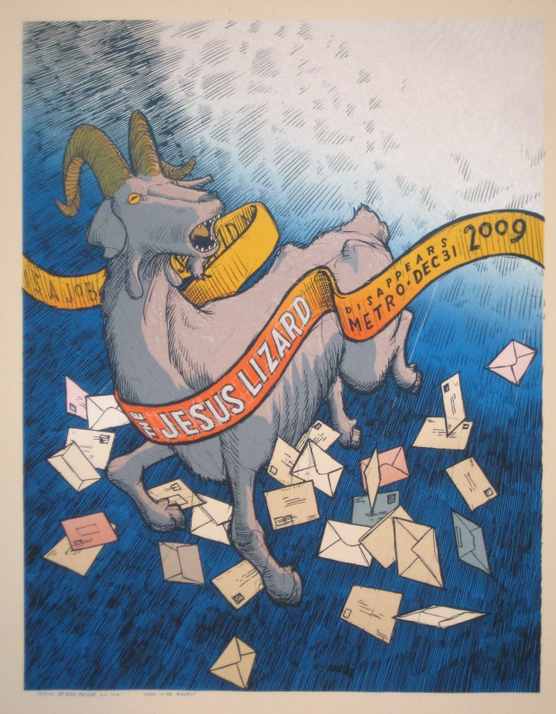
“The Jesus Lizard are Chicago transplants since the ’90s and mostly from Texas, and they were always known for their musical precision and the lovely, slobbering David Yow, crying and flailing across the top of everything with his shirt off and his fly open. They released a handful of excellent records with Chicago’s Touch and Go label before jumping to Capitol and eventually breaking up in 1999. They have reunited twice now for brief tours, and both times they have played at Chicago’s Metro, a 35-year-old rock club down the block from Wrigley Field and where New Order and R.E.M. played early in their careers. The character in the print is a reference to their [the Jesus Lizard’s] album Goat. I enjoy visual non sequiturs and don’t feel like everything should be spelled out for the viewer. Is a goat tumbling through the exploding sky, surrounded by fluttering postal material appropriate for the rock band the Jesus Lizard? Yes. Yes it is.”
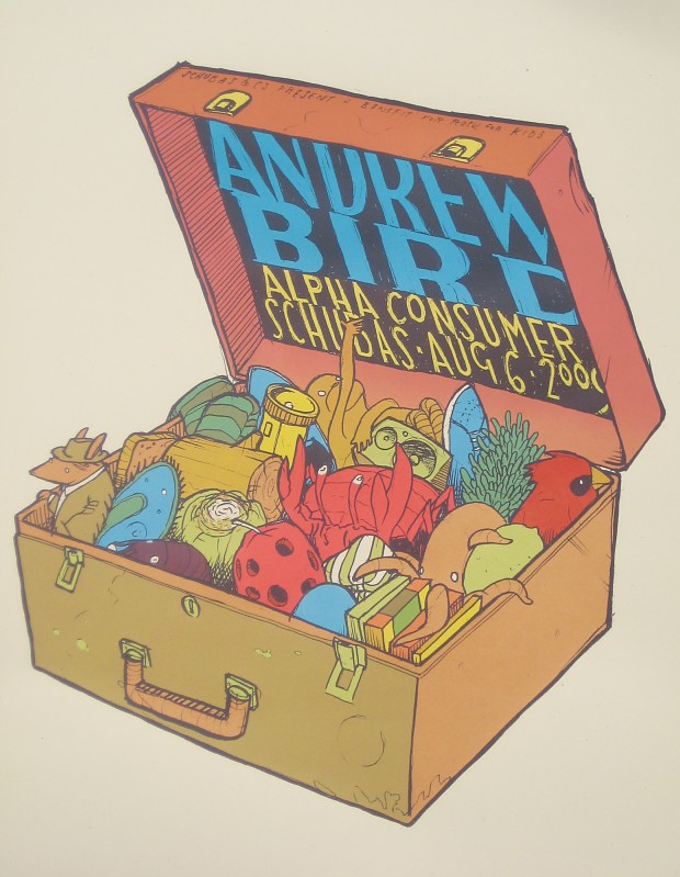
“Andrew Bird is a Chicagoan who now parks his bike in Los Angeles. He grew up here, went to school here, and got his musical self up to speed here, through his bands Charlie Nobody, Bowl of Fire, and into his distinctive solo work. There’s not usually a lot of collaboration or art direction for posters. I welcome a loose idea from the band but mostly just go with what I know of their music, maybe pull some element from an album cover or a character from a song. I want an Andrew Bird fan to be able to look at a print and pick up on why there’s a sock monkey riding a bicycle or a red barn perched atop an iceberg. Andrew and I met and started working together in 1996. Our relationship started with him coming to me with some pretty specific ideas of what he wanted to see on the posters, and over time I think he came to trust my judgment and let me do more of whatever I wanted. He’s one of my favorite musicians. I’ve spent enough time with Andrew to be able to base the imagery on things that have happened to him as well. A favorite of mine is the Lollapalooza after-show print for Schubas in 2009. It’s the contents of Andrew’s suitcase.”
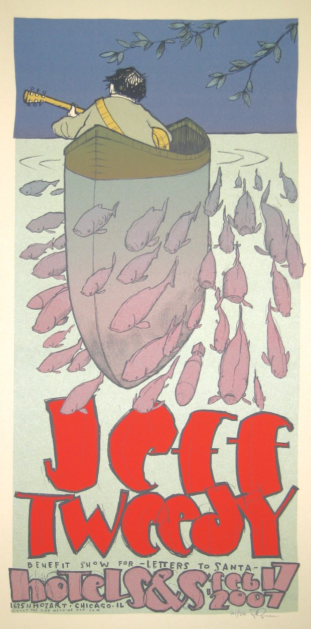
“Jeff Tweedy started out as one of two songwriters in Uncle Tupelo, who were based on the Illinois side of the Mississippi across from St. Louis. Jeff started Wilco in 1994, around the time Uncle Tupelo dissolved, and he moved to Chicago. Wilco has become one of the more famous bands from our city, and they still live and work here. Jeff is very active in helping with local charities, because he’s just simply a good dude. This particular poster was for a living room concert at someone’s house, which had been auctioned off to raise money for the Letters to Santa charity, a group dedicated to providing Christmas gifts to people desperate to the point of writing Santa (‘We really need a bed for my children to sleep in,’ etc.). Jeff is typically Chicago in that he’s just a guy and doesn’t have any particular rock star persona.”
Many towns boast dynamic musical output, but few rival the size of Chicago. And yet despite its international appeal, the city’s rock scene tends towards self-involvement. It’s not a superior stance, though. It’s just that in the Midwest, Chicago is the big city. The city’s pride, developed over 150 years of cultural innovation, has been tempered by dark humor and modest ideals. That contradiction breeds a unique worldview, captured and articulated in Ryan’s work.
Jay Ryan is a Chicago screen printer and poster artist responsible for The Bird Machine print shop. He also plays in the band Dianogah. You can follow his work on Instagram.
